Tag: abstract art
-
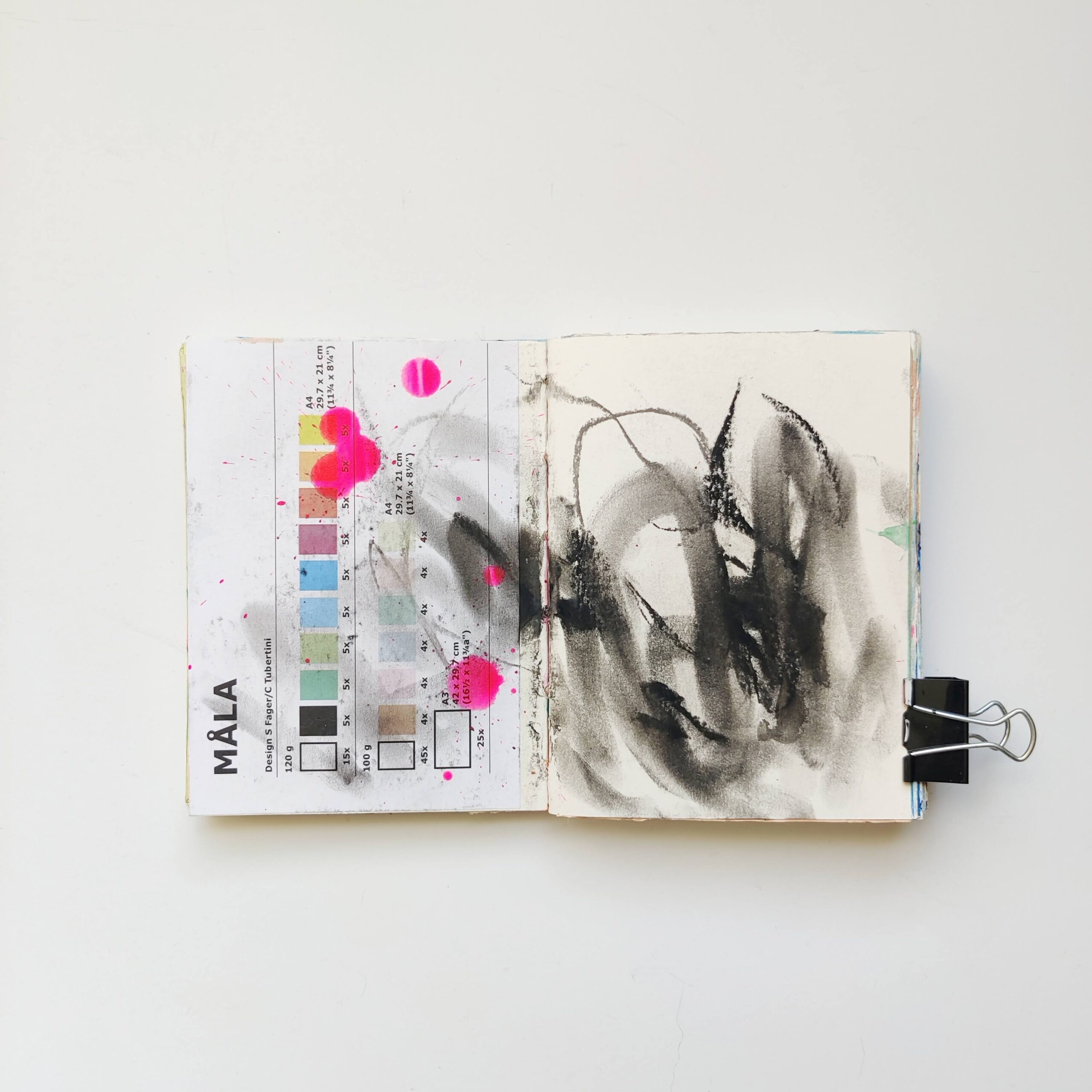
Recent Work
•
I’ve been working near-daily in my art journal — adding collage, oil pastel, tempera paint, drips of acrylic ink, and pencil and paint marker scribbles. Here is some of my recent work.
-
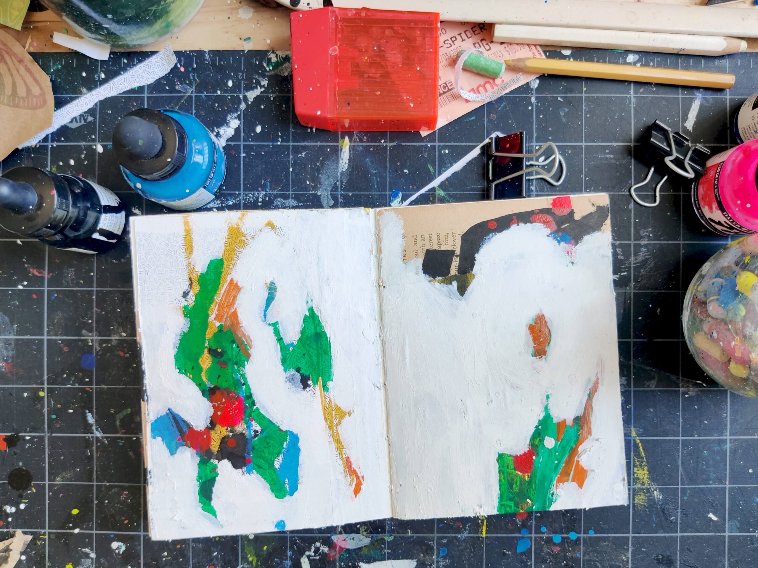
Make Ugly Art
•
For each piece of polished, finished art shared online, every artist has a whole pile of unfinished, “messed up,” or ugly pieces. And that’s exactly as it should be.
-
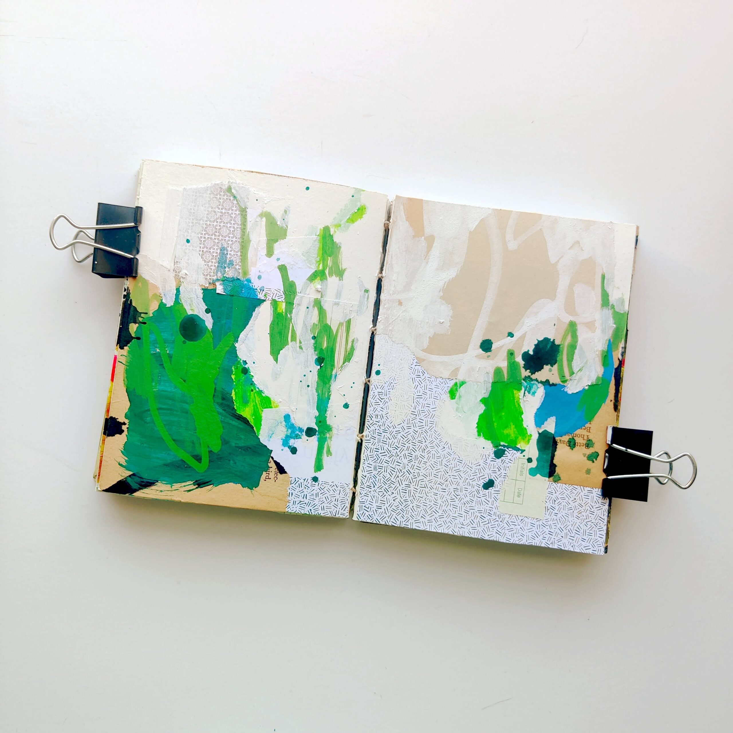
Summer Greens
•
The best days are those where creating comes easily and the results are loose and balanced.
-
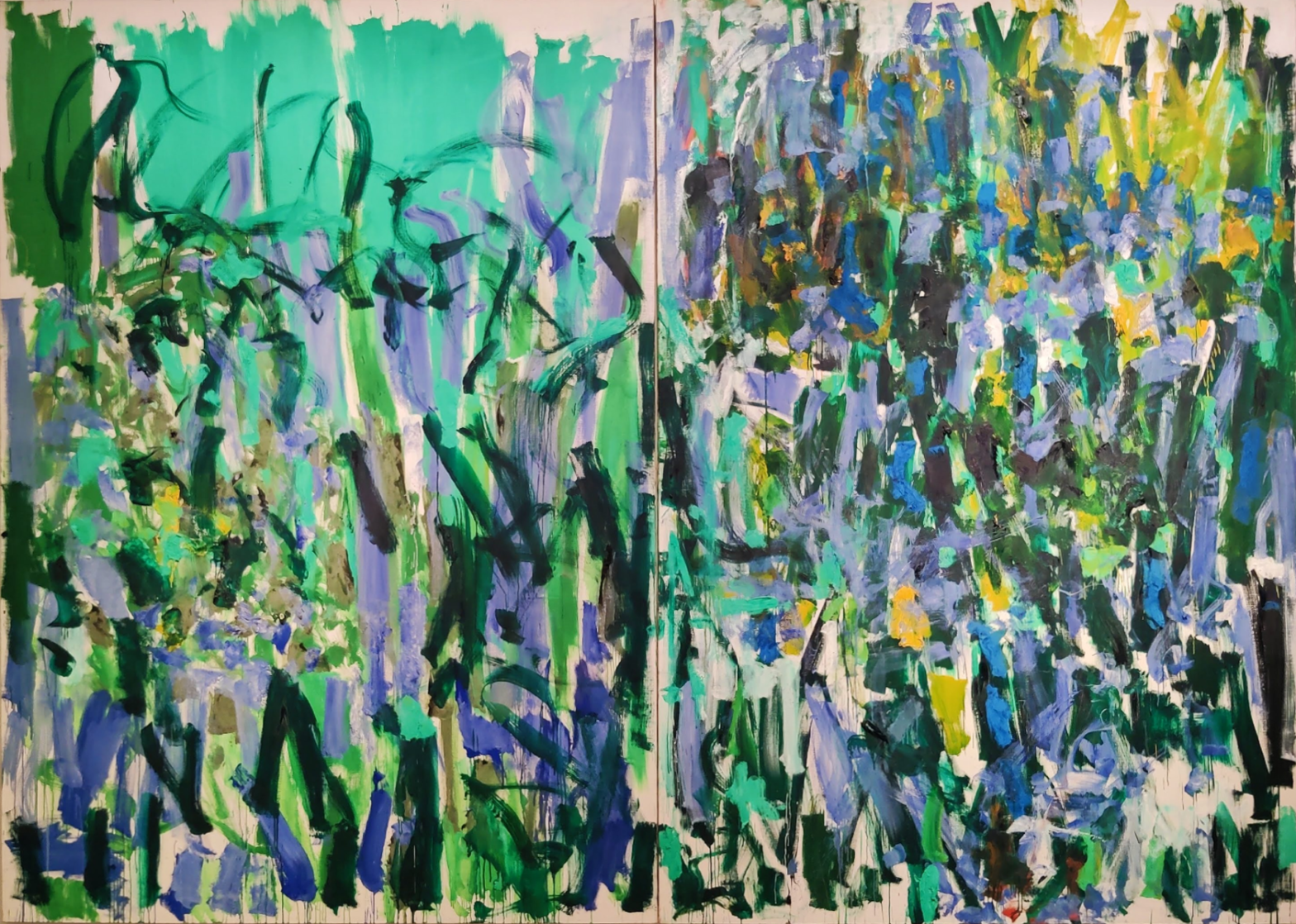
Joan Mitchell
•
In May, I went to see the Joan Mitchell exhibition at the Baltimore Museum of Art; this weekend, I went for the second time.